

The latest data visualization tool to show the relative temperature changes over the last century is as interesting from a graphic and imagery tool as it is compelling from a policy perspective.
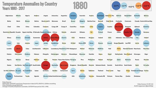
This latest version from Antti Lipponen of the Finnish Meteorological Institute shows the temperature changes by country, localizing the impacts even further.
The US is on the bottom row in the middle. Canada is second from the right on the second row. Click on the image to see the tool move forward in time.
Your support matters.
Public service journalism is important today as ever. If you get something from our coverage, please consider making a donation to support our work. Thanks for reading our stuff.